Around for about 20 years now working in the external supply chain space, we serve both sides of the supply chain, meaning both large manufacturing brands, companies such as Colgate, L’Oreal, P&G, as well as their external manufacturing, contract packing, and 3PL partners. We work very closely with our industry association partners, so that includes organizations like the BCMPA, as well as the United Kingdom Warehousing Association and other industry associations around the globe. We have our headquarters in Toronto in Canada and our UK operations which I head up are based in Bristol.
Next slide. So just to give you a sense of who we serve already in the UK and in mainland Europe, you’ll see that our customers range from small dedicated contract packers and manufacturers, companies like Globecroft and Marsden and Wepack, all the way up to the major 3PLs of the world, DHL, GXO, Kuhn & Nagel, Siva, and most recently Nagel Group in Germany. So we have a good understanding of the whole landscape of the external supply chain from both the co-pack as well as the co-man standpoint.
Next slide please. So you may know us, some of you, as the leader in contract packing software and I just want to take a couple moments to tell you a little bit about that, but that is actually not going to be the focus of today’s webinar. We do provide an end-to-end solution for contract packing.
It’s the industry standard for many organisations who offer co-pack either as a dedicated service or as a value-added service alongside warehousing offerings and that solution enables you to digitalise and optimise the entire contract packing workflow from estimating and planning jobs to managing material and labour on the line, all the way through to digitalising your quality inspections and reporting and analytics. If that’s something you want to learn more about, we’ll have our contact information at the end, but today we’re actually, as I say, going to focus on our newest solution, Smart Factory, and I’m going to hand the floor over to Brian who’s going to tell you more about how that can help you optimise your operations. Over to you, Brian.
Thanks, Joe. Good afternoon, everybody. So, as Joe mentioned, we were originally called Mingo, which was a company that had been around for a little over nine years in the production monitoring machine monitoring space, and so what we’re going to talk about today is an overview of how you use software like this to drive improvements, efficiencies, increase profits, and also can help you increase revenue.
We’ll talk about some case studies and look at a demo as well. So, I’ve been in the manufacturing space for my entire life, since the late 90s, and what really sparked the creation of Mingo was an obvious realisation that this is hard. Co-packing, co-manufacturing, doing this kind of work is really complicated.
Every day is a firefight. You have different challenges. You know, some days you have people problems.
Some days you have material issues. Some days you have equipment problems. Some days it’s all the problems, right, and you’re forced to make decisions with limited information and managing in the rearview mirror.
So, what I wanted to do was create a system that would easily allow you to manage the day-to-day of what’s happening out in the warehouse, right, and get visibility into where the problems are and fix them now, understand long-term trends to provide and provide better data for more accurate decision-making, and then finally, to be able to use that data to improve your operations, whether that’s uncover hidden capacity so that you can sell more or drive down costs, right, so you can increase profits. And so, there’s really two categories that Newelogy Smart Factory helps with. One of them is, like I mentioned, managing the warehouse or the plant.
So, it’s the day-to-day, you know, hand-to-hand combat, as we say. So, being able to understand where the issues are, alert the people, right people at the right time to get them over there to fix them, and moving from reactive to proactive. And then the other side of it is you can use the long-term trends and analysis inside of the system to find areas for improvement.
So, you can look at what are my biggest downtimes on a certain line? What are the biggest downtime reasons? How often is this happening? Why are we running slow, you know, when we’re running certain products? And then you can make decisions to automate, to shift people around, stuff like that, but really use data to drive those decisions versus gut feel. And so, something that really, I think, makes us different and then also helps with driving all of these efficiencies and driving down costs is that New Energy Smart Factory is really easy to use. When we get into the demo, hopefully, you’ll see that it looks really simple, even though there’s a lot of complex stuff going on behind the scenes.
Because it’s easy to use, it’s fast to deploy, and you get a really quick return on investment. Most of our customers get a return on investment in the first year, most of them within the first three months, right? So, really, really powerful. And it’s a system that you won’t outgrow because we have a lot of different modules.
We say start simple, think big, move fast. And you can start very, very simply, like, I just want to know when the lines are up and down, and I want to do that automatically, right? And you can grow all the way into, okay, I want, maybe I have some more automated equipment, I want to connect to the computers or PLCs in there, I want to do quality inspections, I want, you know, maybe you’re packing, you know, food that’s in cold storage, I want, you know, humidity, temperature, all of that information flowing into the system so that, you know, I can correlate that with production. And then finally, it is built for the operations team.
It’s not built for IT. So, that means a couple things. One, to get it implemented, you don’t have to really, you don’t really need time from an already constrained IT department.
Two, you can manage the system yourself. So, if you want to create a new report, if you want to make a change in the system, you can do that without having to go to IT and have them do that, which helps drive, you know, that return on investment as well. And so, what Newelogy Smart Factory at its core does is track a metric called OEE, or overall equipment effectiveness.
Equipment can also be lines, right? And what it’s, at its core, what it’s calculating is how many, how much good product did I produce in an hour, for example, divided by how much good product should have I produced in that hour, right? That’s it. And it’s expressed as a percentage. We can tell where, over nine years of doing this, what a company’s OEE is just by how they collect data.
So, if you’re a company that writes down hourly how many count, you know, your counts, maybe pallets produced, downtime, those kinds of things, and then it goes into Microsoft Excel or something similar and reporting sent out every day or every couple days, you’re typically in the 50s, right? If you’re using a system to record the same data, but hourly and it’s going into a system and you have automated reporting and that reporting is used every day to drive improvements, you’re typically in the 60s. To get to the 80s, which is what, you know, many people think is world-class, you need an automated system. You need that because you need to track these, what we call short stops, but like really short stops on a line that are less than, let’s say, five minutes, or in some cases, even like seven or eight minutes, and then consistently do that.
Because people, you know, if a line stops for a minute or two, they’re not going to write that down on a piece of paper or put it into a system. It’s just not a good use of time, right? So, that’s one of the great areas where you can start to drive more improvements from software like this. And because of this, most of our customers see a 10 to 20% increase in OEE in the first year.
And what that means is if you think back about the formula, I’m getting 10 to 20% more product out the door in the same amount of time, more good product in the same amount of time. So, with the same resources, same equipment. So, just by doing that, right, you’re going to have more labor absorption, more overhead absorption, which is going to help with profitability.
So, I like to talk about one of our customers, Louisiana Fish Fry. They make breading for fish and chicken, and then also spices if you want to make, you know, Cajun, Southern food. They were able to increase their OEE by 12% in the first year.
And the way they did this, and this is what all of our customers do, is fostering a mindset of green is good and getting to green. So, what do I mean by that? And this is the core principle of how you drive efficiency with software like this. This is a picture of their factory floor where they’re bagging these spices, right? So, these are baggers, you know, weighs it and drops it into a bag and seals it and it goes down a conveyor.
And then the operators on the line are packing it into cases and then it gets packed into pallets at the end. So, above every one of the lines, we have what we call a scoreboard. And the scoreboard shows real-time stats on how things are running.
And what they did was, and again, this is very common, they did a scoreboard where on the right hand side, it shows their availability, which is how much of the time that we should be running, are we? So, you know, if I should be running, you know, for an entire hour, it would show 100%. If I only ran 30 minutes, it would show 50%. And then performance.
So, am I running at rate? So, if I should be able to do 100 bags per hour, what percentage of that am I doing? And then finally, quality. So, anytime these numbers dip into the red, somebody, the right person, is notified on their phone and via email that, hey, line six is having too much downtime, get over there and look at it. And each one of the numbers is assigned to a different department.
So, availability is assigned to maintenance, performance is the production team, and then quality is either quality or maintenance. And so, what this does is, it gets the right people to the line as fast as possible to get them back into the green or, you know, the getting to green idea. And then what they use is, they use the historical analytics to say, okay, the problems we had today or the problems we had yesterday, are those long-term ongoing things that we should really address or was this just a one-off, right? And then through that, you know, production meeting every day, which we’ll talk about more, they drive that improvement, right? They say, okay, yes, this problem, we’re seeing this across, you know, a 30-day or even a six-month period, it’s our biggest downtime.
Let’s, you know, assign somebody to fix this and monitor it as they work on it, right? And so, the core principle here is this visualization, the alerts to tell people when stuff is not going right, and then getting them to the lines to fix those problems as quickly as possible and then using the historical data on a regular basis to find these recurring issues. So, how do we do this? So, we talked, you know, through this about automated data collection. So, we can, if you have more automated equipment that has, you know, computers, PLCs in it, we can talk directly to those.
More commonly in the COPAC world and 3PL world, we see, you know, lines with conveyors and stuff like that that are a little more manual, and we have solutions for those too. So, we use these little wireless nodes, we call them hockey pucks, and it allows us to pick up a signal from any sensor, right? So, if you think about a conveyor, you can put a photo eye on it and it’ll count cases or boxes or bags or whatever as it’s going down the conveyor, and it’ll do that automatically. And we, you know, we have a lot of experience across a lot of industries, and so we can suggest how to collect that data and provide that hardware.
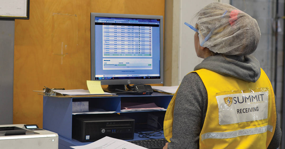
And then for anything that we can’t get automatically, whether through, you know, a sensor and a wireless node or from a PLC, we can ask a user for. So, normally there’s either a computer or a tablet out there on the line where they’ll enter things like scrap, downtime reason if we don’t know why something is down, maybe quality information, pick what job they’re running, that kind of a thing. And then all that information flows up into the cloud where you get the dashboards, the scoreboards we looked at, Louisiana Fish Fry, and then also mobile app, and the operator interface that really, you know, collects all the data.
And then finally, we can integrate with other systems, right? So, we can integrate with maintenance management systems, ERPs, things like that to reduce duplicate data entry. There’s always questions about this slide. So, you know, as we mentioned earlier, please throw any questions in the chat, and I’m happy to answer them as we go through this.
So, let’s look at a little bit more of this setup. So, as I mentioned, this is Louisiana Fish Fry. They have, you know, 17 or so lines.
Above those, they’ll have scoreboards. And then next to the lines, as we talked about, they’ll also have an iPad or an Android tablet or a computer where they’re logging whatever we can’t get from the machines. So, you’ll see that here.
It’s kind of small, but it’s mounted right on the machine itself. There’s another one over here, and it’s close to whoever the supervisor is that logs this information. So, it’s a very common setup.
This is another one. Totally different industry, but you can see the tablet mounted to the machine here. Again, scoreboard.
The one thing I love about this, and I always show it no matter what the audience is, right here is a whiteboard where they used to write down their hourly counts and downtime and what the problems were every hour that we replaced. And then one last scoreboard, one. You might be able to tell that this is an important thing because we keep talking about it.
This is a different format of the scoreboards where I can show all the lines in a facility. So, this company has 19 lines. You’ll see on this TV, there’s nine of them.
On this one, there’s 10. You can see red and green, what’s up and down. So, that’s this column.
If it’s red, it’s down. And then you can see their performance, their OEE, how much have I created today, et cetera. And any of the data inside of the system we can put up here.
So, maybe you don’t track OEE. Maybe you’re more focused on labor efficiency or units per person per hour or pounds per person per hour. Those kinds of metrics can be calculated too.
We can put them on the scoreboards and we can color code them red, yellow, green, and you can use that same getting to green idea on those metrics as well, right? So, it works on anything that we’re collecting. And then the third scoreboard is their production schedule. So, you can load your production schedule, whether it’s from a spreadsheet or an ERP system and then track against that throughout the day.
And this is one of the big efficiency drivers because it can tell you whether you’re on schedule or running behind or ahead of schedule. And it’s a really good way to avoid unplanned overtime, right? So, it’s great. It’ll keep you from the discussions on Friday morning or Thursday afternoon when we’re not going to make it and we have to run mandatory overtime on Saturday, right? Those things are okay for a while, but typically the team gets tired of not seeing their families on the weekend.
Okay. So, let’s actually look at the software. So, I’m going to start with the end in mind, and then we’ll look around the other parts of the system.
So, this is a dashboard inside of Newlogy Smart Factory. When we provision the system, there are eight different template dashboards in the system that have been created over the last nine years based on what most customers want to look at. You can modify these.
So, I can add new things if I want to, right? So, if I want to create a pie chart of something or a table or just a tile, I can do that. I can also edit these given the right permissions. And this goes back to the idea of it’s not for IT.
You’re allowed to manage this on your own, and we really want you to. You can also create your own dashboards. So, let’s say that like the Louisiana fish fry example, we’re really focused on reducing downtime, and this dashboard is a daily production report that’s designed to replace your daily reporting, however you’re doing that now, from the floor.
And so, let’s say I want to sort this by availability, and I want to see which machine had the most downtime yesterday, and we can see it’s FlowRap2 here. It had 66% availability. It only ran 66% of the time that it was supposed to.
So, I can see across the board what my top downtimes are. So, we’ll see like this is our Pareto chart where it says, okay, waiting on quality is number one, lunches, changeovers, which is fine, but I just want to look at FlowRap2 because this is my problem. So, I can filter this, okay, FlowRap2, and we’ll see waiting on quality is actually our number one downtime reason, right? So, going back to the Louisiana fish fry story again is this was just yesterday, right? So, is this an ongoing problem? How long has this been an issue? So, let’s go back 30 days and see what we got, and we’ll see, yeah, waiting on quality.
It’s 49% of our downtime. So, it makes it very easy to have a discussion. I mean, and if I solve this, I’m going to get, I’m going to reduce 50% of my downtime, or even if I get half of this, it’s still a lot, but I can go to the quality department and say, hey, what’s going on here? Why are we constantly waiting for somebody from your department to do something that’s keeping us from producing? And then you can use this to kind of go on down the line, right? So, once quality is solved, the next one is breakdown, belt misalignment, adjustments, et cetera, right? So, it makes this punch list for everybody to work on.
Now, I’ve been talking the whole time about downtime, but the same principles apply with scrap, waste, yield, and also slow running, right? So, performance. If we’re not running at rate or it takes us too long to get up, we can put reason codes on all of this stuff to really drill into the detail, right, and use this same process. The one thing I didn’t mention is that these dashboards, like this daily production report, can be sent out automatically on a schedule.
So, what’s really common is you’ll see this go out this morning, for example, at like 6 a.m. or 7 a.m. after the last shift, and it’s used in a daily production meeting to help drive this improvement. So, usually you’ll have a daily meeting with, you know, the different teams. So, maintenance, engineering, if you have them, quality, and then production to discuss the issues and how we’re going to fix them.
There’s other versions of this report. So, you know, if we look at, I’m just going to look at today on a single machine here, my Flow Rep 2, you can, you know, do a deep dive on a single piece of equipment. This is a timeline that shows, shockingly, waiting on quality.
Let’s do that one more time. So, it shows red when we’re down, unplanned downtime, green when we’re running good, and then blue for planned downtime. But we can see, you know, when is this waiting on QA actually happening? So, it gives us another view into the information.
You know, is it around lunch and breaks? Is it around startup and shutdown? Those kinds of things. Let’s take a look at yesterday. So, you know, we can see it’s pretty choppy, red and green.
We have a bunch of planned downtime here, right? So, dashboards are really easy to use. They’re a tool, you know, for looking at historical data to really help you drive improvement over time, right? So, then let’s talk about how all of this data comes together and gets rolled up into those dashboards. So, we built something we call a scheduling system.
It’s not a scheduling system similar to what you would have in an ERP or in Newelogy shop floor. What it’s really designed to do is take that schedule from that ERP system or Newelogy shop floor and then be able to track against it in real time to tell you if you’re ahead or behind schedule. And so, what we have here are my two FlowRap machines.
And what this allows us to do is make minor changes to that schedule that’s been produced somewhere else and then communicate those changes directly to the team on the floor. So, let’s say FlowRap 2 is broken down, right? And we just can’t use it. I can really easily move all of those jobs over to the other machine if it can run the same equipment, right? Run the same products.
I can also change priorities, right? So, let’s say, okay, part A, we can’t run because we have a raw material issue. I can pull all of the part B products up and let’s say we’re going to run those next, right? So, it makes it very easy to communicate these changes out to the floor. You don’t have to go back to the ERP system.
And really, what we’re doing is digitizing that process that happens already today. Like, you run the schedule in a system or a spreadsheet and somebody usually hands out paper and says, run this in this order on these lines, right? And so, we’re doing that digitally instead. Reduces the paperwork, reduces mistakes.
So, now, if we take a look at where this all comes together, we’ll look at the operator screen. So, this is the screen that’s on a tablet or a computer out by the lines. If you have a line with multiple people, usually the line leads the one that’s going to interact with this.
So, it’s designed to do two things. One is tell me how I’m doing, right? So, red, yellow, green, how am I doing? And we can see my availability is in the yellow. I’ve had too much downtime.
My performance is in the green, which means I’m running at rate when I’m running and my quality is 100%. And then the other thing it tells us is or allows us to do is enter data that we can’t get automatically. So, one of those could be what job am I running, right? So, I have a list here that comes from the scheduling system of what I need to run next and we’ll see part B is at the top of that list.
I’ll just start this. And now I’m running a new job, right? I need to make 461 of these. I’m running pretty fast.
So, I’m going to finish this in about six minutes, right? So, it gives us that feedback. And if I start running behind, like if I ended up with a downtime or something, that number is going to start, you know, going up the time to complete. So, a couple other things that we can do on downtime.
I talk about downtime a lot because it’s where most of the inefficiencies are initially if you’re not tracking data automatically. We can track change over times. So, you can set what’s a standard from changing from one product to another.
And I don’t know if you probably didn’t see it because it went by very quickly, but we can have a countdown timer that says, you know, hey, you have 30 minutes to do this, you know, it’ll count all the way down to zero so that the team knows, you know, where they are with that. And that can really help drive efficiencies because, you know, changeovers can eat up a lot of your time. The other thing that we can do is record downtime.
So, when the line stops, right? So, let’s say we have that little photo eye that’s counting bags or cases as they go down the conveyor. When it stops, we know that and can set a threshold and then prompt the operator or the line lead for a reason code. So, they would get a screen that looks like this automatically.
They wouldn’t have to click. And these are downtime categories, which you would set within the categories. You have reason codes.
Let’s just do an example of call maintenance. And I say, hell, our machine’s on fire. And with the getting to green idea, you can have this sent to your phone and our mobile app based on the settings.
I’m just waiting for this to come up. Okay. And I will show you that.
So, right here it says, blow wrap to call maintenance. So, I could be the maintenance person, you know, on call for this line. And then if I click into that, it’s going to take me into the mobile app where I can see the exact same information that I was looking at on the tablet or the computer, right? I can look at history.
I can look at, you know, any file attachments like troubleshooting information for the machine here. I can change downtime reasons. Right? So, you know, if it was not down, you know, it’s down for call maintenance.
But once maintenance comes over, maybe maintenance says, okay, actually, it was a belt misalignment. Right? I can edit those. I can change those directly in the app.
And so, I don’t have to go back to a computer to do any of this. You know, maintenance people are typically mobile. Some of the supervisors are also the same way.
And they can be notified and look at how things are running directly on their phone. For management, you can also have access to the dashboards on here. Really, anybody with the right permissions can have access to the dashboards.
And you can have the same information we were looking at before. You know, maybe you want to see how the plant’s running, you know, second shift or third shift, or you have dinner or go to bed. That can be accessed from the phone as well.
And the very last thing here is we’ll show some live scoreboards. This is an example of a single machine scoreboard running pretty well. But there’s many different versions of these.
Right? So, we can look at, you know, one that’s showing all the equipment in the plant. So, we can see, like, our bottling line has a breakdown. It’s been down for 17 minutes.
We’re monitoring a batching process here. You know, it’s been going on for 11 minutes and 30 seconds. Things like that.
So, any of the data, you know, we have flowing through the system, we can make visual. Right? So, yeah. So, that’s the high-level overview of the system and really how it helps drive, you know, helps drive downtime reduction, overall efficiency within the warehouses.
And really the core thing here, I mean, it’s two things. One is the software and being able to reliably collect this data and make it visual. The other part of it is the getting to green idea.
Right? Let’s notify people when things are not going the way that they should. Let’s get them to the lines to fix those issues as quickly as they can. And then use that data, the analytics to go back and say, okay, what are our biggest problems that we’re going to fix to make sure that this stuff doesn’t continue to happen? Right? We’ll stop here for a second and see what questions folks have.
Please put your questions in the chat if you’ve got any. So, go ahead, Gemma. I’m just seeing one coming through, Brian, asking about the setup of the system and what’s involved.
Yeah. So, it’s pretty straightforward to set it up. So, there’s, I think I might have a slide.
I don’t want that. I don’t. So, it’s a pretty fast process.
We have done them in a week or so, but the typical timeframe is about four to six weeks. And the process is like this. Your team is trained on how to use the system remotely via Teams or Zoom.
You know, how to set things up, add downtime codes, parts, how does the whole thing work? And then we send someone on site for a couple of days that helps with, for three days, helps with hardware installation, validation of the data from the hardware.